Responsive (or mobile optimised) website design is nothing new – it’s been around for years under different names “fluid” or “liquid” web design for example. Though the techniques are all a bit different, the concept never really took off, despite web designers best efforts of predicting future screen size changes (remember 800 x 600 on your old monitor?).
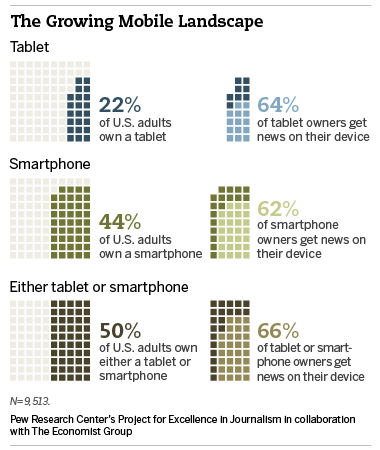
What has changed in the last few years, is the explosion of hand-held and mobile devices that have introduced a whole plethera of screen sizes and swipe-ability – and catapulted the need to provide an optimal website experience into every website design conversation.
What is a responsive website, or mobile optimised webdesign? Quite simply, it’s a website that is easy to interact with, read and navigate with a minimum of resizing, panning, and scrolling—whether the visitor is using a desktop computer monitor, a mobile phone, a tablet (e.g. iPad or Galaxy Tab), Kindle or other device – and increasingly in 2013 and beyond – the internet ready TV.
Since this growth is relatively new, many different techniques are in use, particularly because operating systems (e.g. Windows, Android or Apple’s IOS) and browsers (e.g. Firefox and Internet Explorer etc,) have not traditionally agreed on which standards to adopt. However, that is now changing and best practices and industry standards are emerging.
The rise in global e-commerce presents another challenge in its own right, but especially so when considered in combination with the increased use of mobile devices. In other words, how to ensure that your online shop is optimised for mobile. The answer is – it’s tricky! It doesn’t take much to find an online store on your mobile device – but try to zoom a product, add to cart or check-out and you will find that it will usually be a lot more difficult and will take much more time and effort.
What does this mean for your business? First of all, you need to be selling online. Secondly – you need to ensure that your site is mobile friendly. Since research shows that online shoppers are a fickle bunch, if they can’t easily find what they want on your site, they’ll go elsewhere. Can you afford to lose another sale?
So how can you optimise your website for your mobile users, and particularly – for mobile shoppers? Get in touch with us to find out how we can help you!


